
Restructuring digital finance architecture to bridge the trust gap for 18 million legacy banking users
We redesigned iMobile's card management system - simplified complex terminology and visuals, surfaced key actions, and built a modular structure that scales across multiple cards.
Organization
ICICI Bank
Team
Me, 1 Product Manager,
2 Developers
Timeline
14 months
Restructuring digital finance architecture to bridge the trust gap for 18 million legacy banking users
We redesigned iMobile's card management system - simplified complex terminology and visuals, surfaced key actions, and built a modular structure that scales across multiple cards.
Organization
ICICI Bank
Team
Me, 1 Product Manager,
2 Developers
Timeline
14 months
Making credit cards easier to understand
Credit cards come with complex terminology and dense information. The redesign focused on simplifying visuals and structuring information so users could quickly understand their card status, limits, and dues without needing to decode the interface.
1/3
Clarity

Key financial information first
Actions at decision points
Amount due, due date, and credit utilization are surfaced immediately so users can quickly understand their card status.
Primary actions like Pay Now and AutoPay are placed next to payment information to reduce friction.
1
2


iMobile: Cards system designed
to grow and earn trust

Building iMobile - ICICI Bank's card management system
Building iMobile
ICICI Bank's card management system
2023 - Shipped
2023 - Shipped
Context
ICICI is one of India’s most trusted legacy banks with over 18 million
active card users
iMobile is ICICI's primary mobile banking app with 28 million users, 400+ banking services, and a cards experience that hadn't kept pace with how much users were depending on it.
Context
Problem
Strategic problem: Trust Gap
While users trusted ICICI Bank as a legacy institution, they struggled to trust its digital interface.
Prior to the redesign, the card dashboard suffered from three core systemic friction points:
Core Design philosophy: Familiarity over novelty
Restraint over
reinvention
Instead of dismantling the existing patterns, we optimized the familiar wireframe structure to preserve user confidence.
Novel gestures
Tested swipe-to-pay paradigms, but discovered they introduced mobile accessibility barriers. We implemented alternatives to swap the swipe gesture.

Control
Testing proved users did not want dense data dashboards; they wanted clear, linear guidance on what action to execute next.
Cards were simplified visually to mirror the information and layout of a physical card, making them instantly recognizable.
Impact
Thinking about mental models and real-world cues
I aligned the visual design with users’ mental model of a physical card, translating familiar cues into the digital interface. This reduced cognitive load and build confidence.


Surfacing the right action at the right moment
Once the users feel equipped with the information they require, we want to understand what is the most probable action the user is going to take at that point in the user journey.
2/3
Control


Paying the bill is the most common reason someone opens this screen
Pay Now action sits beside the due amount, so the information and the action arrive together.
Pay Now
Autopay
Manage limit


AFTER
BEFORE
The card screen is the starting point for every job a user comes to do. Tap an action to see where it leads and why it lives there.
Everything branches from one screen
Users taking action on ads is a high intent action and when placed at irrelevant points, it increases the friction.
Ads bring profit for the business but friction for the users
BEFORE
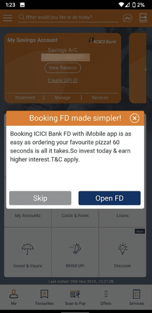
Ads showed up in pop ups, they were
intrusive and shown aggressively
AFTER
Ads were placed strategically and contextually.
Banners are embedded inline only when they match a
user's current intent, transforming a ad into a
logical next step.
Designing for multiple cards
We rethought the entry point for each card and instead of a single stack users had to dig through, each card got its own identity and direct access point.
The way that users moved through the app changed fundamentally. The idea was that your most used card should feel one tap away, and switching between cards shouldn't feel like starting a new task.
3/3
Scale
2

User with no cards
Debit, credit, travel, and prepaid categories are structurally defined up front establishing a clean visual taxonomy.
User with each card type
Every card dynamically lands in its correct category so users find tools based strictly on utility.
User with multiple cards
Dues, limits, and contextual actions update seamlessly underneath the exact same container frame.
BEFORE
Cluttered, fragmented, overwhelming
AFTER
Transparent, accessible, guided

Redesigning card management experience for a growing, complex experience in digital finance
We redesigned iMobile's card management system - simplified complex terminology and visuals, surfaced key actions, and built a modular structure that scales across multiple cards.
Organization
ICICI Bank
Team
Me, 1 Product Manager,
2 Developers
Timeline
14 months
Context
ICICI is one of India’s most trusted legacy banks with
over 18 million active card users
iMobile is ICICI's primary mobile banking app with 28 million users, 400+ banking services, and a cards experience that hadn't kept pace with how much users were depending on it.
Meaningful usage metrics take time to surface in a product at this scale, so rather than lean on early numbers, here's what I can point to today.
Meaningful usage metrics take time to surface in a product at this scale, so rather than lean on early numbers, here's what I can point to today.
The work we did for ICICI went live in February 2026!
The work we did for ICICI went live in February 2026!
"Credit card transactions are confusing. Got confused whether my bill is paid or due. Please fix."

Comprehension gap
Temporal blindness
Navigation friction
"The number of ads makes me feel like I downloaded an illegal version of some scamming app. "
Thinking about mental models
and real-world cues
I aligned the visual design with users’ mental model of a physical card, translating familiar cues into the digital interface to reduce cognitive load and build confidence.

"Credit card transactions are confusing. Got confused whether my bill is paid or due. Please fix."
"The number of ads makes me feel like I downloaded an illegal version of some scamming app. "
"The number of ads makes me feel like I downloaded an illegal version of some scamming app."
Comprehension gap
Temporal blindness
Navigation friction
Comprehension Gap: Dense financial terminology obscured basic card statuses, leading to accidental missed payments.
Comprehension Gap: Dense financial terminology obscured basic card statuses, leading to accidental missed payments.
Predatory Visual Friction: Aggressive, non-dismissible cross-selling ads for loans and co-branded variants made users feel insecure, mimicking untrustworthy, unverified applications.
Predatory Visual Friction: Aggressive, non-dismissible cross-selling ads for loans and co-branded variants made users feel insecure, mimicking untrustworthy, unverified applications.
Temporal Blindness: Real-time user behavior was completely unguided, leaving users confused about whether actions like bill payments had successfully processed.
Temporal Blindness: Real-time user behavior was completely unguided, leaving users confused about whether actions like bill payments had successfully processed.
Business implication
When users avoid managing cards digitally due to app anxiety, it directly inflates customer support call volumes, people miss payments, and they don't explore features.
Initial exploratory concepts favored trendy, gesture-heavy UI patterns. However, usability testing with ICICI’s primary demographic—which includes a significant population of older adults—reframed our execution:
Designing for Latency: Maintaining user trust during API delay
Legacy APIs delayed real-time limit updates post-payment by up to 48 hours. Instead of hiding this, we designed a provisional 'Payment Processing' status badge directly on the card face to eliminate user anxiety and prevent duplicate payment attempts.
Designing for Latency: Maintaining user trust during API delay
Legacy APIs delayed real-time limit updates post-payment by up to 48 hours. Instead of hiding this, we designed a provisional 'Payment Processing' status badge directly on the card face to eliminate user anxiety and prevent duplicate payment attempts.
Designing for Latency: Maintaining user trust during API delay
Legacy APIs delayed real-time limit updates post-payment by up to 48 hours. Instead of hiding this, we designed a provisional 'Payment Processing' status badge directly on the card face to eliminate user anxiety and prevent duplicate payment attempts.
Designing for Latency: Maintaining user trust during API delay
Legacy APIs delayed real-time limit updates post-payment by up to 48 hours. Instead of hiding this, we designed a provisional 'Payment Processing' status badge directly on the card face to eliminate user anxiety and prevent duplicate payment attempts.

Transactions were categorized into Unbilled and Unsettled to make sure user don't get confused

Badge and inline cue to inform users of their transaction status
Designing for Latency: Maintaining user trust during API delay
Legacy APIs delayed real-time limit updates post-payment by up to 48 hours. Instead of hiding this, we designed a provisional 'Payment Processing' status badge directly on the card face to eliminate user anxiety and prevent duplicate payment attempts.
Transactions were categorized into Unbilled and Unsettled to make sure user don't get confused
Badge and inline cue to inform users of their transaction status
Designing for Latency: Maintaining user trust during API delay
Legacy APIs delayed real-time limit updates post-payment by up to 48 hours. Instead of hiding this, we designed a provisional 'Payment Processing' status badge directly on the card face to eliminate user anxiety and prevent duplicate payment attempts.
Designing for Latency: Maintaining user trust during API delay
Legacy APIs delayed real-time limit updates post-payment by up to 48 hours. Instead of hiding this, we designed a provisional 'Payment Processing' status badge directly on the card face to eliminate user anxiety and prevent duplicate payment attempts.
Transactions were categorized into Unbilled and Unsettled to make sure user don't get confused
Badge and inline cue to inform users of their transaction status
Transactions were categorized into Unbilled and Unsettled to make sure user don't get confused
Transactions were categorized into Unbilled and Unsettled to make sure user don't get confused
Badge and inline cue to inform users of their transaction status
Badge and inline cue to inform users of their transaction status
Transactions were categorized into Unbilled and Unsettled to make sure user don't get confused
Badge and inline cue to inform users of their transaction status
Minimal regression
Aligning closely with existing, proven user mental models minimized edge cases and eliminated user onboarding friction during deployment.
Engineering Cleanliness
Developing a component-driven, modular layout cut down front-end code complexity, allowing the development team to ship seamless optimization patches with minimal layout disruption.
Engineering Cleanliness
Developing a component-driven, modular layout cut down front-end code complexity, allowing the development team to ship seamless optimization patches with minimal layout disruption.
Problem
Strategic problem:
Trust Gap
While users trusted ICICI Bank as a legacy institution, they struggled to trust its digital interface.
Prior to the redesign, the card dashboard suffered from three core systemic friction points:
Business implication
When users avoid managing cards digitally due to app anxiety, it directly inflates customer support call volumes, people miss payments, and they don't explore features.
Core Design philosophy:
Familiarity over novelty
Initial exploratory concepts favored trendy, gesture-heavy UI patterns. However, usability testing with ICICI’s primary demographic—which includes a significant population of older adults—reframed our execution:
Restraint over reinvention
Instead of dismantling the existing patterns, we optimized the familiar wireframe structure to preserve user confidence.
Novel gestures
Tested swipe-to-pay paradigms, but discovered they introduced mobile accessibility barriers. We retained explicit, high-contrast action taps.
Control
Testing proved users did not want dense data dashboards; they wanted clear, linear guidance on what action to execute next.
Designing for Latency: Maintaining user trust during API delay
Legacy APIs delayed real-time limit updates post-payment by up to 48 hours. Instead of hiding this, we designed a provisional 'Payment Processing' status badge directly on the card face to eliminate user anxiety and prevent duplicate payment attempts.
Badge and inline cue to inform users of their transaction status
Transactions were categorized into Unbilled and Unsettled to make sure user don't get confused
Ads bring profit for the business but friction for the users
Users taking action on ads is a high intent action and when placed at irrelevant points, it increases the friction.
BEFORE
Ads showed up in pop ups, they were intrusive and shown aggressively
AFTER
Ads were placed strategically and contextually.
Banners are embedded inline only when they match a
user's current intent, transforming a ad into a
logical next step.
AFTER
BEFORE
Impact
The work we did for ICICI went live in February 2026!
Meaningful usage metrics take time to surface in a product at this scale, so rather than lean on early numbers, here's what I can point to today.
Minimal regression
Aligning closely with existing, proven user mental models minimized edge cases and eliminated user onboarding friction during deployment.
Engineering Cleanliness
Developing a component-driven, modular layout cut down front-end code complexity, allowing the development team to ship seamless optimization patches with minimal layout disruption.